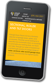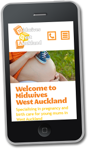
What is Responsive Design and Mobile Optimisation?
With the web world bandying about such terms as ‘responsive design’ and ‘mobile-optimised’, it might be a great time to explain what they mean to you.
In a world that is becoming increasingly tech-savvy and the technology becoming more accessible, more and more potential customers are using their mobile devices, such as their phone or tablet, to access websites on–the-go (Read the Google press release here).
In most cases this results in an unpleasant experience, with users having to zoom in and out to read text or click buttons, and in some situations not being able to navigate through the site.
The idea behind mobile-optimisation is to remedy this problem. And the most popular approach is through responsive design.
Responsive design addresses the issue of having a separate version of your site for mobile phones and tablet devices. A responsive website tests for screen size and delivers the same content but with a different set of styles that make it better suited for viewing on smaller screens.
This means website owners only need to make a change in a single place when updating content instead of multiple changes on mobile and tablet versions of their sites. This also ensures users see a website that looks like it was made for their device and that they can actually use it.

The term mobile-optimisation encompasses responsive design. Mobile optimisation is simply the goal of delivering a better user experience to visitors on mobile devices. More than just moving content around and resizing it to fit your screen, mobile optimisation also considers the effect the website has on loading time.
In general, mobile networks, and the devices themselves are a little lacking when it comes to speed, so this also needs to be addressed when designing for them.
By testing for screen size, or ideally connection speed, mobile optimised websites can deliver images that have a smaller file size or they can deliver content that appears on the desktop site ‘on demand’.
We live in a world where instant satisfaction is expected and choices are endless, and the difference between your customer and your competitor’s customer could be the time it takes for your non-mobile-optimised site to load.
Talk to us at Jigsaw Design to get a mobile optimised site before your customers shop elsewhere.

